Project Summary
The owners of "Rechna Gara" (“River station”) had a dream - to transform a former river station on the banks of the Danube into a one-of-a-kind restaurant offering exceptional cuisine and an immersive atmosphere for an unforgettable dining experience. That was the essence of our brief. The rest was up to us.
Trusting us with such a dream was a great responsibility and we took it with pride. Our task wasn’t just to craft a visual identity, but to develop a comprehensive guideline that would serve as a foundation for even the interior design. Every element had to be cautiously thought out. We made sure that every detail—right down to the smallest—contributed to an enjoyable experience. From the logo to the website, to the branded napkins, every piece was designed to inspire guests to embark on a captivating river journey.
Our Approach to Establishing a Visual Language
We drew inspiration from the natural flow of the river, the surrounding banks, and the local fishing culture. We incorporated industrial aspects typical of ships and harbor stations to complement these elements. This way we achieved a distinctive blend where classic modernism takes the lead, enriched with a steampunk-inspired "fish train" that adds a touch of extraordinary.
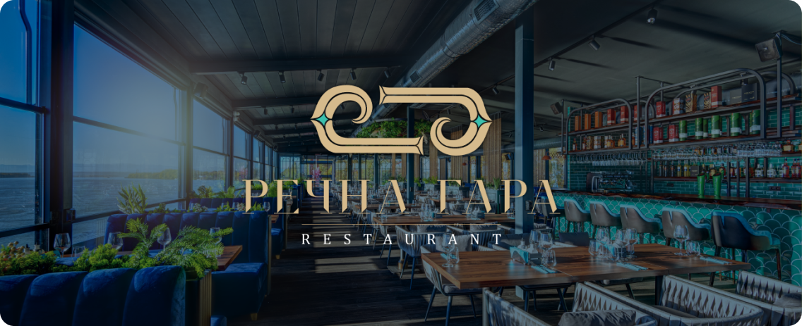
Logotype and Logo Symbol
The logo embraces classic modernism, characterized by elegant serif fonts, embodying the timeless beauty of the location and the sophistication of the interior, paired with the high standards of the cuisine. The logo symbol, a stylized fishing hook that can also be seen as a river wave, became the focal point. This element was then transformed into various shapes and patterns, becoming an integral part of the overall interior design.
Color Palette
The color palette reflects the ever-changing colors of the water across different seasons, depths, and moods. As an accent, we introduced a shade of gold, resembling the sandy shoreline and adding a touch of timelessness. The palette was carefully designed to translate seamlessly into interior elements, print materials, and digital platforms.
Graphics
To this style of classic modernism, we added elements of steampunk - three distinctive artistic graphics of fisherman, fish, and fishtrain, which became a distinctive accent both in the interior and the printed materials.
Outcome
We crafted a cohesive and recognizable design across every element, from staff uniforms and table mats to napkins, menus, the website, and social media, ensuring meticulous attention to detail. The website was developed with a user-friendly admin interface, allowing for quick and easy updates to seasonal and weekly offerings. Our carefully produced videos and photos beautifully captured the restaurant’s ambiance, cuisine, and atmosphere, transporting the audience into the heart of the dining experience. The trilingual menu is approachable and accessible, and the restaurant’s delivery service has quickly gained popularity in the local community.
Client Testimonial
"We were looking for an agency that would truly understand our vision and invest all their creativity into developing an original approach to the identity of the place we dreamed of. We chose Hyperzone because they are a boutique agency, and they work fast and efficiently. Our collaboration was seamless at every level. What they delivered was not only different but also far more beautiful and original than what we had imagined. We are grateful for their dedication to our project!"
— Ico & Maria Vakovi, Owners